Start with the smallest view
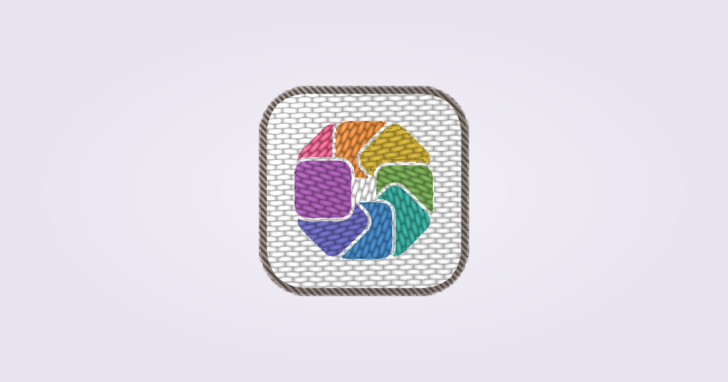
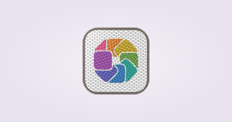
Keep your large editor preview for drawing, but make design decisions at the size the icon will actually appear.
- Import a draft as a Custom Icon and look at it in your normal Dock.
- Ask whether the main shape reads before you study the detail. Simplify the silhouette if it does not.
- Check the icon against your wallpaper and neighboring apps. Increase contrast where important edges disappear.
- Open Command-Tab and check the same artwork at that size.
Leave room around the shape
An icon that fills every edge can feel larger than its neighbors even when the image dimensions match. Leave enough padding for the silhouette and its shadow to breathe.
Compare visual weight, not just the outer bounds. A thin outline and a solid block rarely need identical padding to feel balanced.
Add detail in layers
Establish a recognizable shape first. Add color, then material, then a small amount of detail. Recheck the Dock after each step.
If removing a detail improves recognition, leave it out. Fine texture should support the main form rather than become the only thing you see.
Check the finish in context
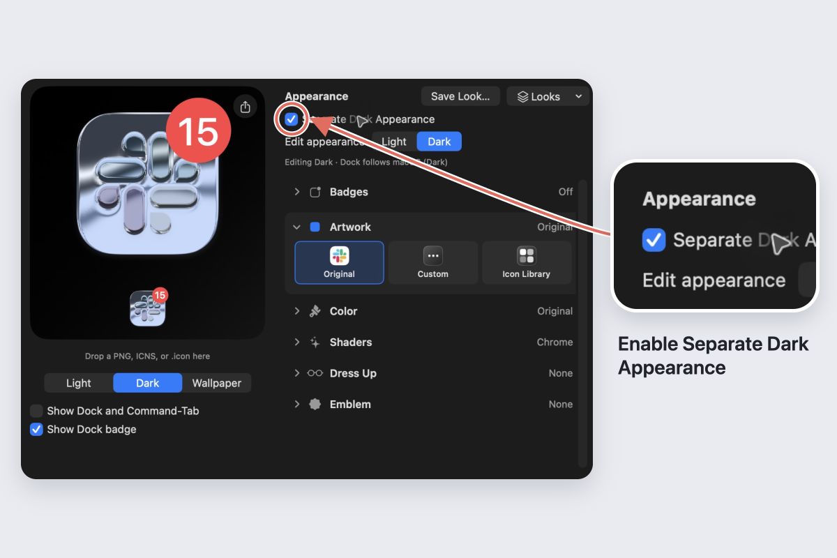
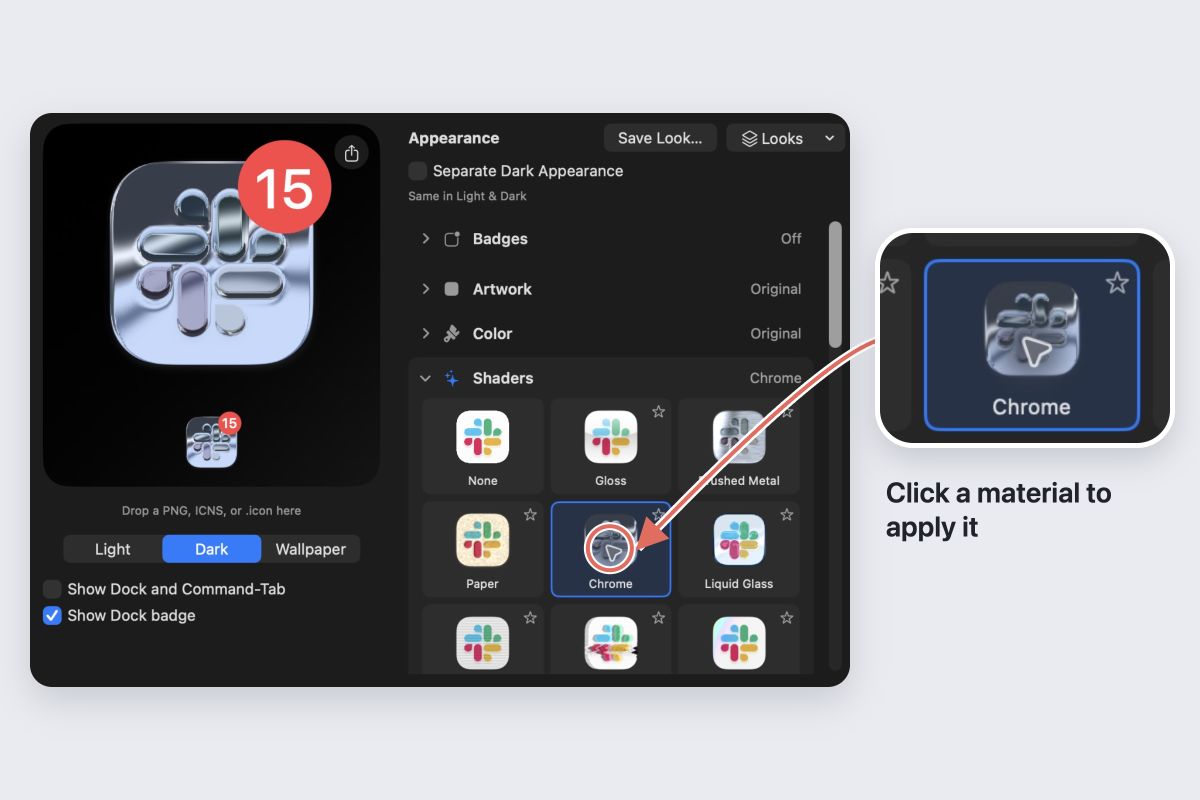
A strong shader can reduce contrast or hide small features. Lower Strength and compare again. Test Light and Dark appearances if you use both.
Save a copy of the source artwork before experimenting. Keep the version that reads quickly, even if the larger preview looks less elaborate.