Start with three apps
Choose three apps with different silhouettes. A useful first set might include a browser, a writing app and a messaging app.
- Add each installed app as a Custom Icon in IconSwapper.
- Style one icon with a single material, such as Brushed Metal or Paper. Avoid replacing its artwork just to make it match.
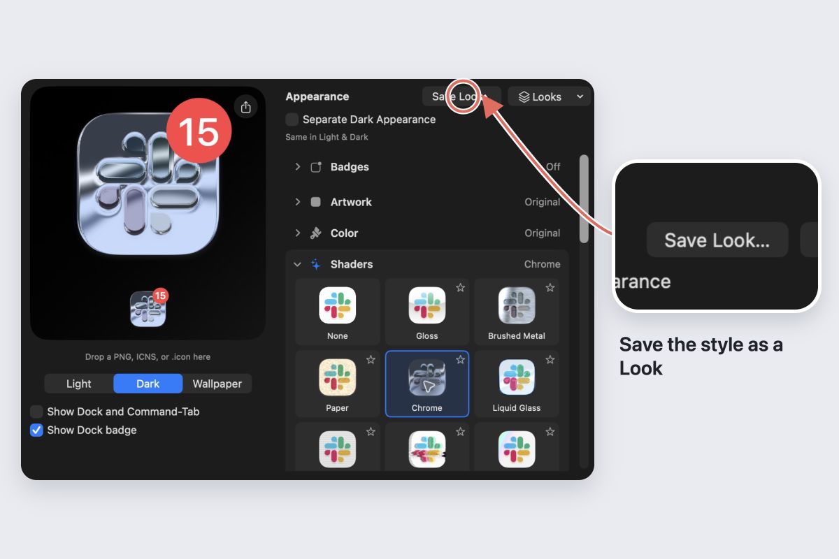
- Choose Save Look…, name the treatment, then choose Save & Preview….
- Select the other apps, inspect the set and apply the Look.
Saved Looks preserve each app’s artwork and emblem. The shared material provides continuity without making the icons identical.
Match the treatment rather than every color
Keep each app’s identifying color where it helps recognition. A consistent material and similar visual weight can be enough.
Compare the set in the Dock. If one icon looks much heavier, reduce the treatment’s strength or simplify its decorations rather than adding more detail to everything else.
Check a busy and a simple icon
A finish that works on a broad shape may hide small lettering or a fine symbol. Use the most detailed icon as a stress test, then refine that app individually.
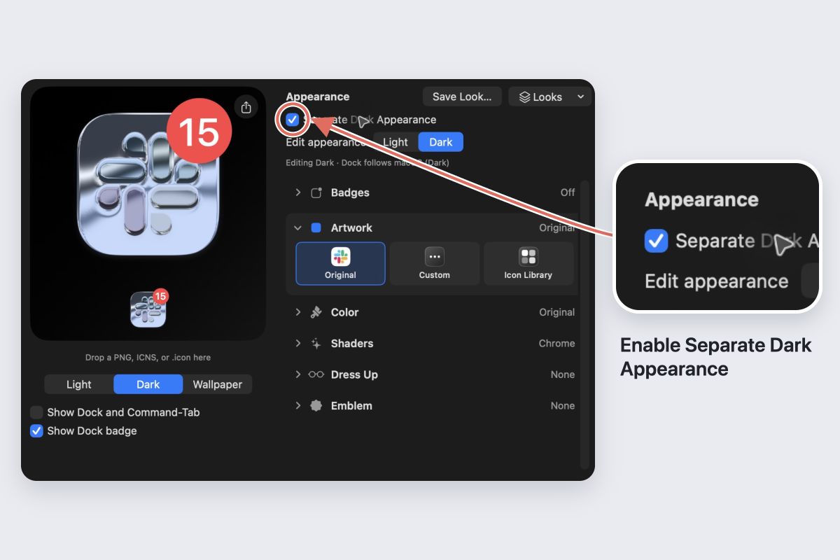
If you use separate Light and Dark appearances, repeat the review for both. A Look applies to the currently selected editing appearance.
Expand the set gradually
Add a few more apps only after the first group works at Dock size. Keep the Look named clearly so you can reuse it. Use the batch result’s Undo Look if the set does not work, or restore an individual icon.